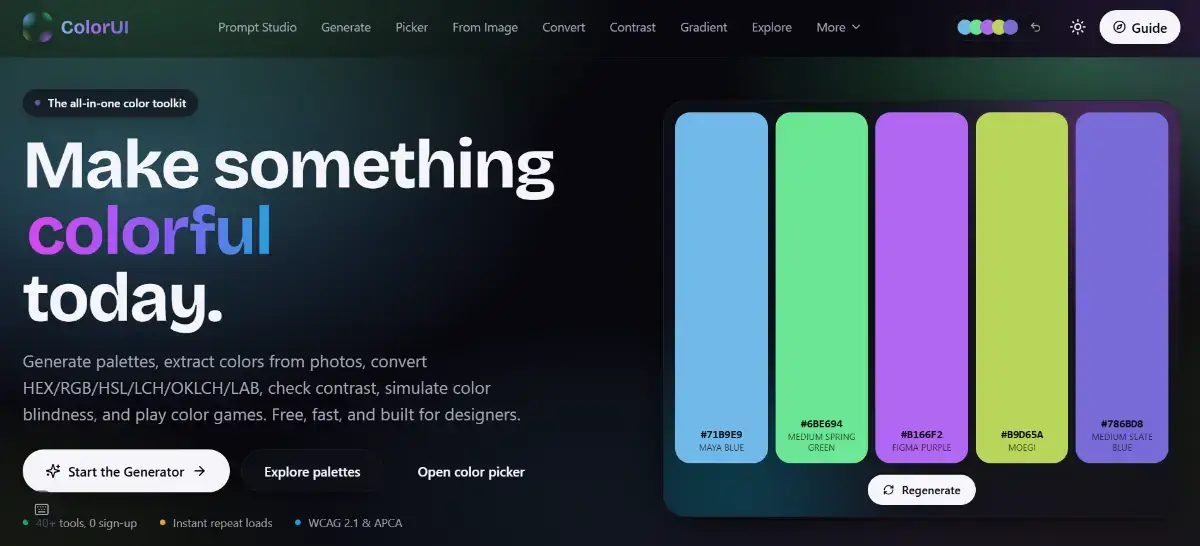
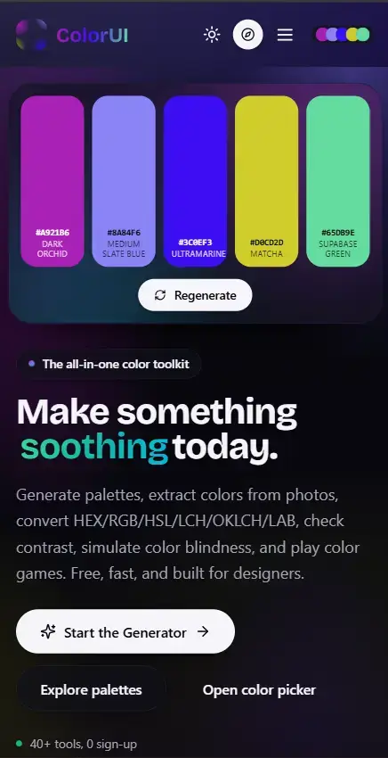
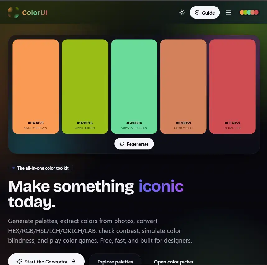
ColorUI.io is a curated, high-utility design canvas and micro-SaaS platform crafted specifically for developers, UI/UX designers, and digital creators who want to build stunning modern web interfaces.
Moving far beyond generic, flat color-picker sites, ColorUI.io functions as an interactive frontend preview laboratory. It treats color theory not just as isolated hex codes, but as a living, breathing technical layout utility, optimized for production-ready development workflows.
🎨 The Aesthetic Identity: "Cyber-Glass" & Futuristic Utility
The platform is built on a dark mode, high-contrast, technical dashboard layout often described as Cyber-Glass. It balances technical utility with an elegant, cinematic interface design, featuring:
Deep neon accents against rich, dark backgrounds.
Subtle frosted glassmorphism surfaces (
backdrop-filter: blur).Razorsharp borders, layout grids, and smooth micro-interactions that mirror advanced developer tools like Vercel, Supabase, or Linear.
🚀 Core Engineering & Workflow Features
1. Live Layout Context Previews
The main problem with classic color palette tools is that a collection of color swatches looks beautiful in a row, but it’s nearly impossible to visualize how they translate to a real web application. ColorUI.io solves this by dynamically mapping selected palettes onto live component mockups. With a single click, you see your colors applied directly to:
Navigation bars, sidebar menus, and dashboard stat cards.
Interactive CTA buttons (default, hover, and focused states).
Real-world typography hierarchies (headings, body copy, and muted captions).
2. Accessible Contrast Ratios (WCAG Compliance)
Built into the core interface is a strict engineering utility designed to test color contrast in real-time. It calculates relative luminance to verify that text-to-background combinations hit WCAG AA and AAA accessibility standards, guaranteeing that any palette exported from the app is completely readable and enterprise-ready.
3. Advanced Design-to-Code Export Engines
ColorUI.io eliminates the tedious manual copying of individual hex codes. Once a layout palette is finalized, developers can export the entire framework into native technical design tokens with a single click:
Tailwind CSS: Instantly generates a clean extension block to drop straight into your
tailwind.config.jstheme parameters.CSS Custom Properties: Generates native
:rootCSS variables (--primary,--background, etc.) for seamless vanilla or component-driven styling.Next.js / React Tokens: Pre-formatted JSON objects ready to step directly into modular component theme providers.